Last year, we invited the 2015 class of Exhibition Design at the FH Joanneum to perform UX testing on our website. Instructor Konrad Baumann introduced the students to the “Thinking-Aloud”-method of Steve Krug, a technique that my class was introduced to as well as part of our Content Strategy studies.
DIY Usability testing
The method is based on observing the user behavior of a website visitor while they perform given tasks. The entire process is documented via audio and screen capture. You can watch a full intro video on YouTube or read Krug’s book Rocket Surgery made easy. The DIY method is low on cost and will yield great results, granted the scenarios to perform are chosen well. UX guru Jakob Nielsen said in 1993:
You only need 5 users to find 85% of the site’s usability issues.
Some think this number is too low due to technological and demographic changes in the past 20+ years. Nielsen assumed, that most issues are staring you in the face and should get discovered rather quickly, which might not necessarily hold true anymore today. Issues that are less apparent could potentially still impact 1,000’s of users and might result in the loss of revenue. However, 98% of all issues should get discovered by around 80 test users. Online tools like Hotjar and RapidUsertests provide easy access to a larger test group on a small budget.
Either way, I think that unless your website is your major source of revenue, 5 users will most likely suffice to help improve your website. In our case, we had 16 users (each student performed the test with one test person), and it resulted in quite some overlap. The overlap also confirmed there truly is an issue, so for us it worked nonetheless.
Testing our website
Our museums are organized under an umbrella organisation called Universalmuseum Joanneum. However, visitors cannot actually visit the Universalmuseum, they can only visit the individual museums such as Kunsthaus Graz and Schloss Eggenberg. This poses a challenge for our online visitors when they navigate our website.
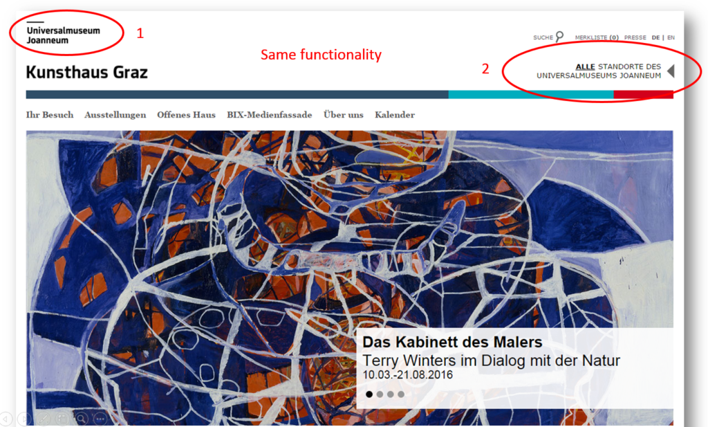
People research our museums and land on the respective museum site e.g. Kunsthaus Graz. The header on our site includes 2 logos. The umbrella organisation logo in the left upper corner and below a second logo of the museum you’re currently navigating. In addition, there is a text link on the right that points to all locations, which lands you on the same page as the upper left logo.
Test persons assume to get back to the homepage of a website when they click on the logo. When they click on the Universalmuseum Joanneum logo however, they accidentally land in the generic section of our umbrella organisation and get confused because the navigation and content changed. As a result from landing on a page they don’t expect they sometimes leave all together.
Website islands
Another issue related to the problem above deals with the lack of network between our museums. Ever museum site is it’s own “island” with little to no links to other museums at all. This is a particular challenge for our content creators in each museum. They simply are not used to consider other content aside from their own, and they most likely are not even aware of other museum’s content. Much training will be needed to raise awareness and understanding why it is so important to create those links that help visitors navigate our site.
One example that became very apparent was the situation in Schloss Eggenberg. The park around the castle is home to 4 museums, but until recently there was very little information about that present. A single box on the museum homepage and text links in the right column (subject to banner blindness) were simply not sufficient, as this example shows.
The test person is currently in Schloss Eggenberg and should find out if there are other museums nearby. He first looks in the section “Your visit” and can’t find anything, so he keeps browsing through the site.
Eventually the visitor drops off into the umbrella organisation from where he figures out there are other museums at the same location. Considering that this visitor had to fulfill a particular task, he certainly was more patient than a regular online visitor who most likely wouldn’t have found out until their actual visit – at least not from our website.
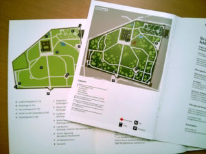
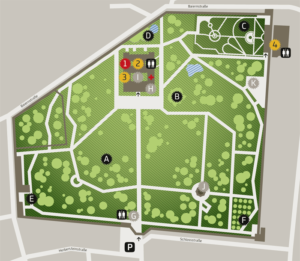
As a result to this scenario we developed a new page that now provides a location overview of all the sights and points of interest. At the top of the page is a map for orientation. When we created this page, I remembered seeing a map of the park in one of our books we created in house. Another brochure had a similar map with other details of information. Our graphic design department combined those two maps to a more fitting version including all sights.
- We created a new map based on these 2 maps in a book and a brochure.
- The new map specifies where you currently are and shows all the sights.
We ended up with 4 versions of the map and the location overview page, each emphasizing the particular museum the user currently visits online. For better understanding, the map also includes additional points of interest, such as the gardens, shop, cafe and parking. The content for each museum specifies the exact location, opening times and distance to the other museums.
Traffic on those pages immediately picked up and we’re already planning additional location overviews for 3 more museum sites. This new content will help the visitor to obtain full comprehension of everything that is being offered at Schloss Eggenberg.
This project combines several elements of Content Strategy:
- UX
- analysis
- content inventory and audit
- as well as content creation.
Why you should do it
We’ve know about some problems with our website for a while, but watching the users navigate through the site made it so much more apparent. Most of all, the video documentation helped build a case for investing into optimizing the user experience. So now we need to come up with a plan to fix the issue and test potential solutions. This also provided leverage for setting up a test server, since it’s not advised to make such radical changes in a live system.
In my class we also debated whether this DIY method is still viable today. I personally can highly recommend it; the focus is on a qualitative survey, it’s cheap and it provides lots of material to work with. The tests also identified a few quick wins we simply were not aware of and could fix immediately.
The students performed their tests in summer but were unable present the results until November. By that time we had resolved some issues we were already aware of. However, we where happy to see that the students had identified those issues as well during testing, so now we know we’re on the right track. I’m looking forward to more tests and to hopefully finding proof that our upcoming changes fixed the issues as intended.


